
Summum
Uniting three pillars of a boutique sports agency under one premium identity
Context
Summum is a boutique agency working across three pillars: athlete management, sports partnerships and professional performance coaching. Each pillar speaks to its own audience, from elite athletes to corporate decision-makers, and each one stands strong on its own. Summum asked me for the full picture: a brand strategy, a visual identity, and a website to launch it with.
Problem
The challenge was to bring these three directions together under one coherent, premium identity. It had to feel exclusive and boutique, never broad or generic, without flattening what makes each pillar distinct. An identity that leans too far toward one pillar loses the other two. One that tries to please all three ends up saying nothing. Summum needed a single brand strong enough to hold all of them.

Process
We started with strategy, before any design. The session began with the brand's character: what Summum should feel like, and where it sits on scales from clean and minimal to bold, and from modern to classic. That pointed toward a dark, confident direction: bold but grounded, and far from corporate or gimmicky. One detail from that session became an anchor for the whole design. The client had sketched the double M at the heart of "Summum" as two mountain peaks. I developed that into a visual motif that runs through the identity. From there I built moodboards along three distinct directions and tested them against the positioning and the three pillars. We converged on the one that captured both the exclusivity and the sportiness the client was after. Every later choice, from logo concepts to the final identity, was checked against that foundation before moving forward.
Proposal
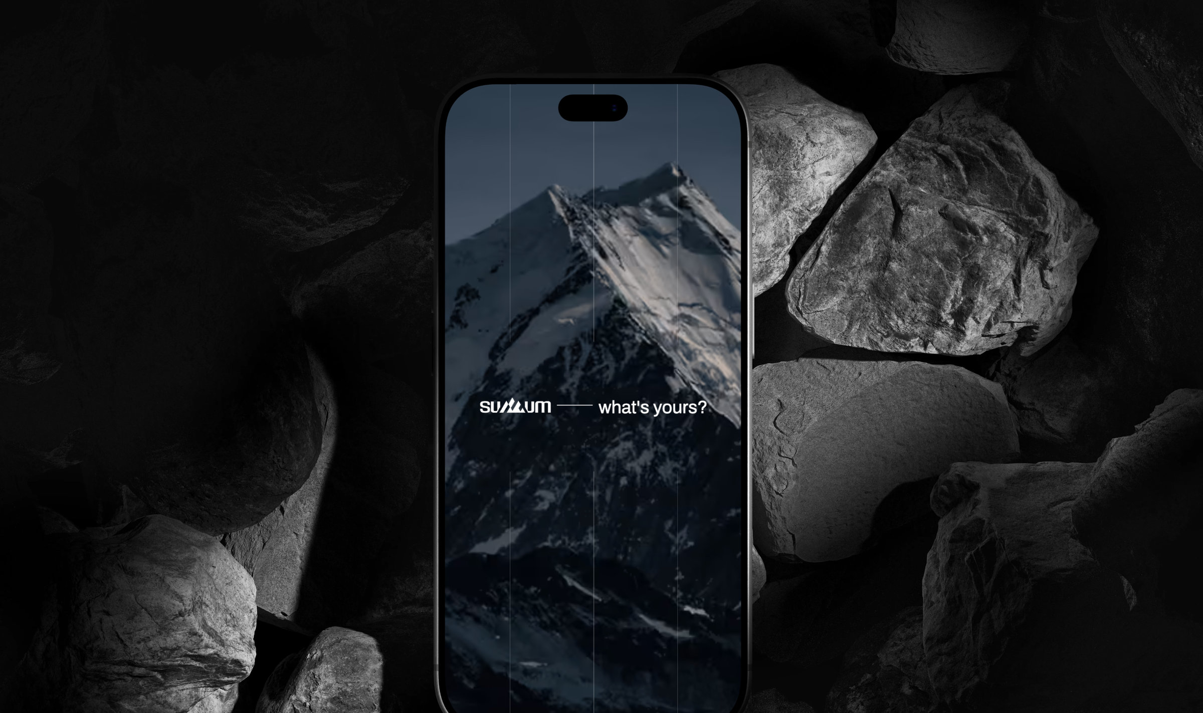
A dark, sophisticated identity carried by a single mint accent, a nod to winter sports and the mountains at the heart of the brand's story. Large, outspoken imagery gives the brand its edge. Each pillar gets its own icon and photography style, so it stays recognisable within one system. A technical yet modern typeface adds speed and dynamism, and contour lines return throughout as the most literal expression of the summit idea. The identity carried straight into a compact landing page, the brand's first real touchpoint: a hero slider, a services overview, team introductions and a contact form. Interactions and animation are tuned to amplify the bold, sporty feel.


Result
Summum launched with one premium identity that holds all three pillars together, and a live site to carry it. The client also received a full brand guide and a presentation deck to run their own marketing and communication from. That means the identity didn't end with this project. It became the foundation for everything Summum does next.


